(42)
笑脸蜘蛛|小咖咖啡·大师甄选上海首店
门店:大师甄选上海首店
设计: 笑脸蜘蛛|Spider Creative
摄影:余几
Brand: MINI-CO
Store:Shanghai First Reserve Store
Design: Spider Creative
Photography:YUJI
Min-co First Coffee Master Store In Shanghai
MINI-CO|CUP OF SURPRISES
小咖咖啡的诞生,始于对 “专业” 与 “温度” 的双重追求。以 “大师甄选” 为核心,从咖啡豆的严选到空间的营造,每一处细节都在诠释品牌对品质的坚守 —— 不止于一杯咖啡的风味,更在于传递 “简约而不简单” 的生活态度。
小咖咖啡-甄选心意,自然无间
The birth of MINI-CO began with the dual pursuit of "professionalism" and "temperature". With "Master Selection" as the core, from the strict selection of coffee beans to the creation of space, every detail embodies the brand's commitment to quality - not just the flavor of a cup of coffee, but also conveying a "simple but not simple" attitude towards life.
小咖咖啡以圆形咖啡渍作为核心品牌Logo进行打造 —— 杯底那抹深浅不一的渍痕,是每杯咖啡的独特签名。小咖咖啡从这日常又细腻的印记里,读懂了当代年轻人的精神密码:在标准化世界偏爱不规则的灵动,于趋同潮流中坚守个性的棱角。
MINI-CO uses circular coffee stains as its core brand logo - the varying shades of stains on the bottom of the cup are the unique signature of each cup of coffee. Xiaoka Coffee has understood the spiritual code of contemporary young people from this daily and delicate imprint: preferring irregular agility in a standardized world and adhering to the edges of individuality in a trend of convergence.
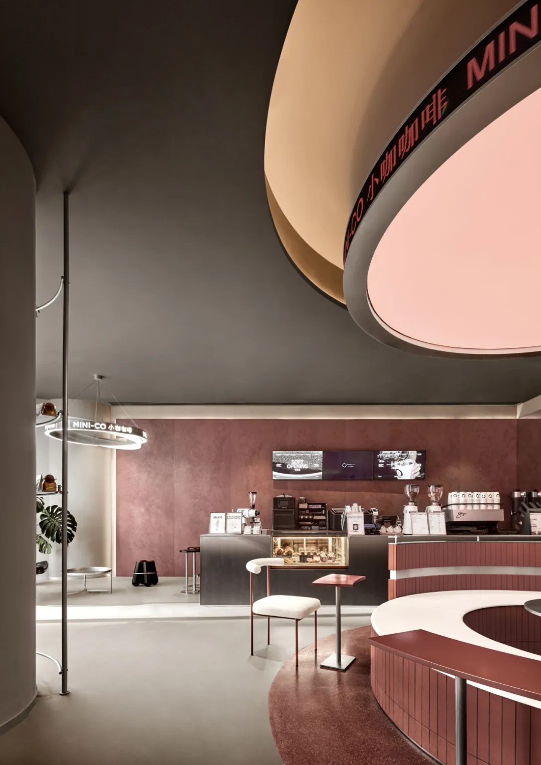
笑脸蜘蛛从品牌 LOGO 的圆形符号与 “质感红” 基调切入设计,为其打造了这间上海大师甄选首店。将抽象品牌基因化为可触的空间语言。
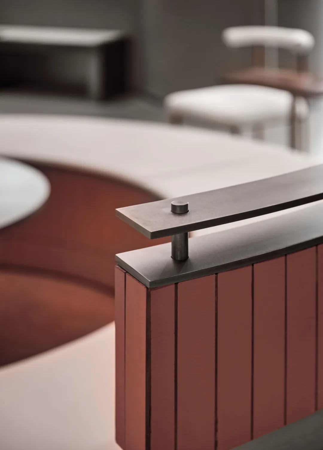
以质感红为主基调的色彩体系,是空间最鲜明的语言。不同于流于俗艳的红色,这里的红被赋予了雅正的灰度 —— 它是沉稳的、专业的,像品牌对咖啡品质的坚守般不动声色,却自带张力。
The color system with textured red as the main tone is the most vivid language of space. Unlike the vulgar red, the red here is endowed with an elegant gray level - it is calm, professional, and like the brand's commitment to coffee quality, it remains calm but carries its own tension.
当这份质感红与冷质的灰色金属肌理相遇,两种材质的碰撞瞬间激活了空间的当代性:红色的暖与金属的冷形成微妙平衡,既保留了咖啡场景的温度,又注入了现代设计的利落调性。而白色作为点缀,巧妙穿插于灰色墙面与红色重点区域之间,让色彩层次更显透气,从视觉上便传递出品牌 “专业中见细腻” 的特质。
When the texture of red and the cold gray metal texture meet, the collision of the two materials instantly activates the modernity of the space: the warmth of red and the coldness of metal form a subtle balance, retaining the temperature of the coffee scene while injecting the sharp tone of modern design. And white serves as an embellishment, cleverly interspersed between the gray wall and the red key area, making the color hierarchy more breathable, visually conveying the brand's "professional yet delicate" characteristics.
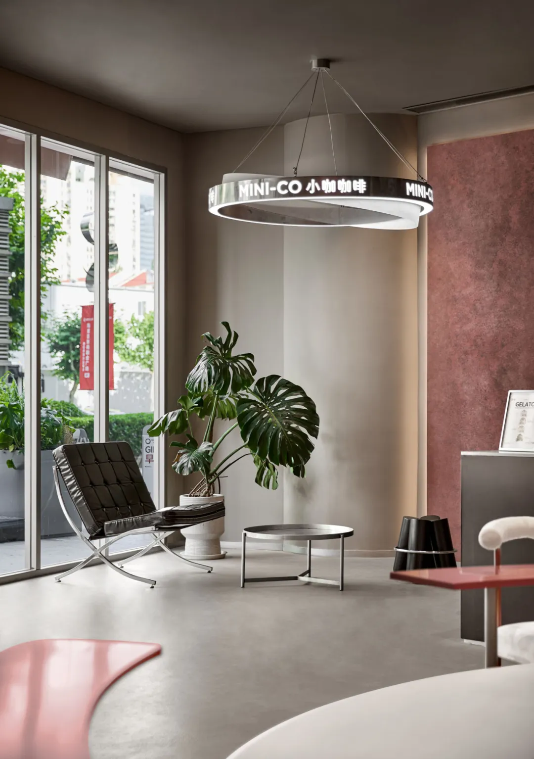
The entrance is equipped with a sofa rest area, featuring designer classic Barcelona chairs and simple metal round tables, complemented by green plants. This layout presents the texture of iconic furniture and the organic integration of natural elements, creating a relaxed and moderate transitional space. It not only enhances the quality of the scene with classic design language, but also creates a calm and comfortable entry experience for customers through the vitality of green plants and the comfortable attributes of furniture.
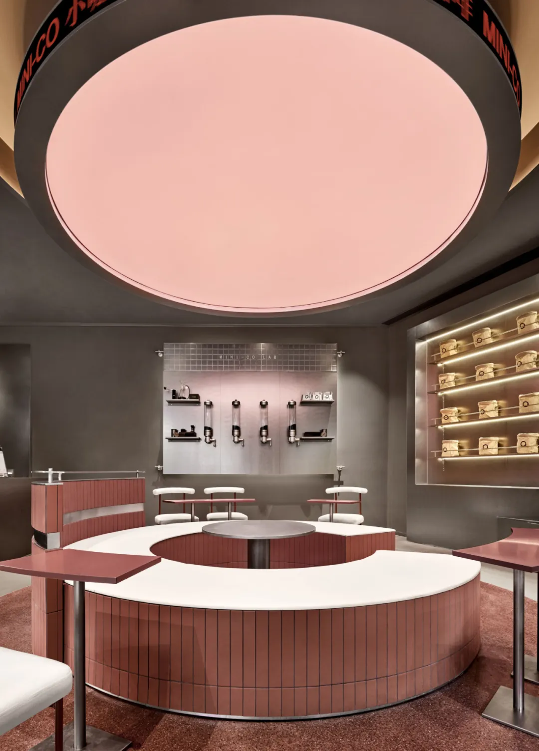
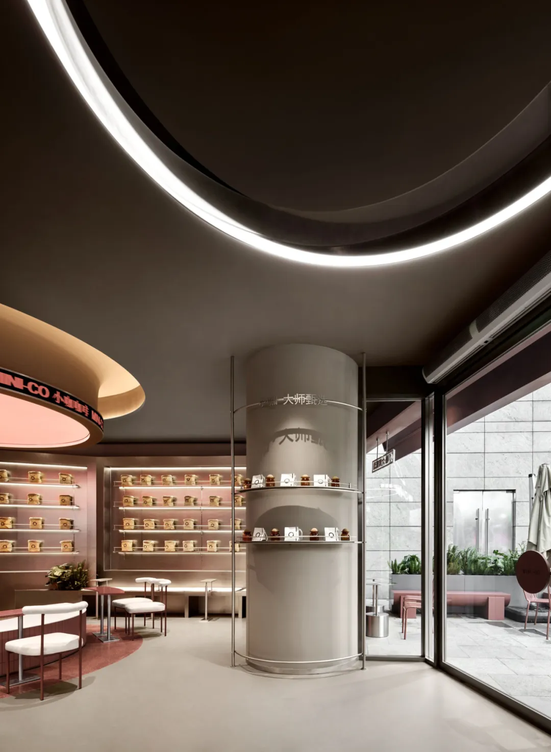
The narrative logic of the lamp film installation space always closely follows the circular gene of the brand. As soon as you enter the room, the circular light film installation becomes the visual focus with a warm posture: the light gray pink light film spreads out like thin fog, which is a concrete expression of the brand concept. There is no exaggerated shape, but it echoes the brand's proposition of "simplicity with ingenuity" with an atmospheric contour.

Around the lamp film, the red font of "MINI-CO Coffee" flows with light and shadow, creating a delicate and trendy atmosphere in minimalism, allowing the brand symbol to naturally blend into the spatial atmosphere.

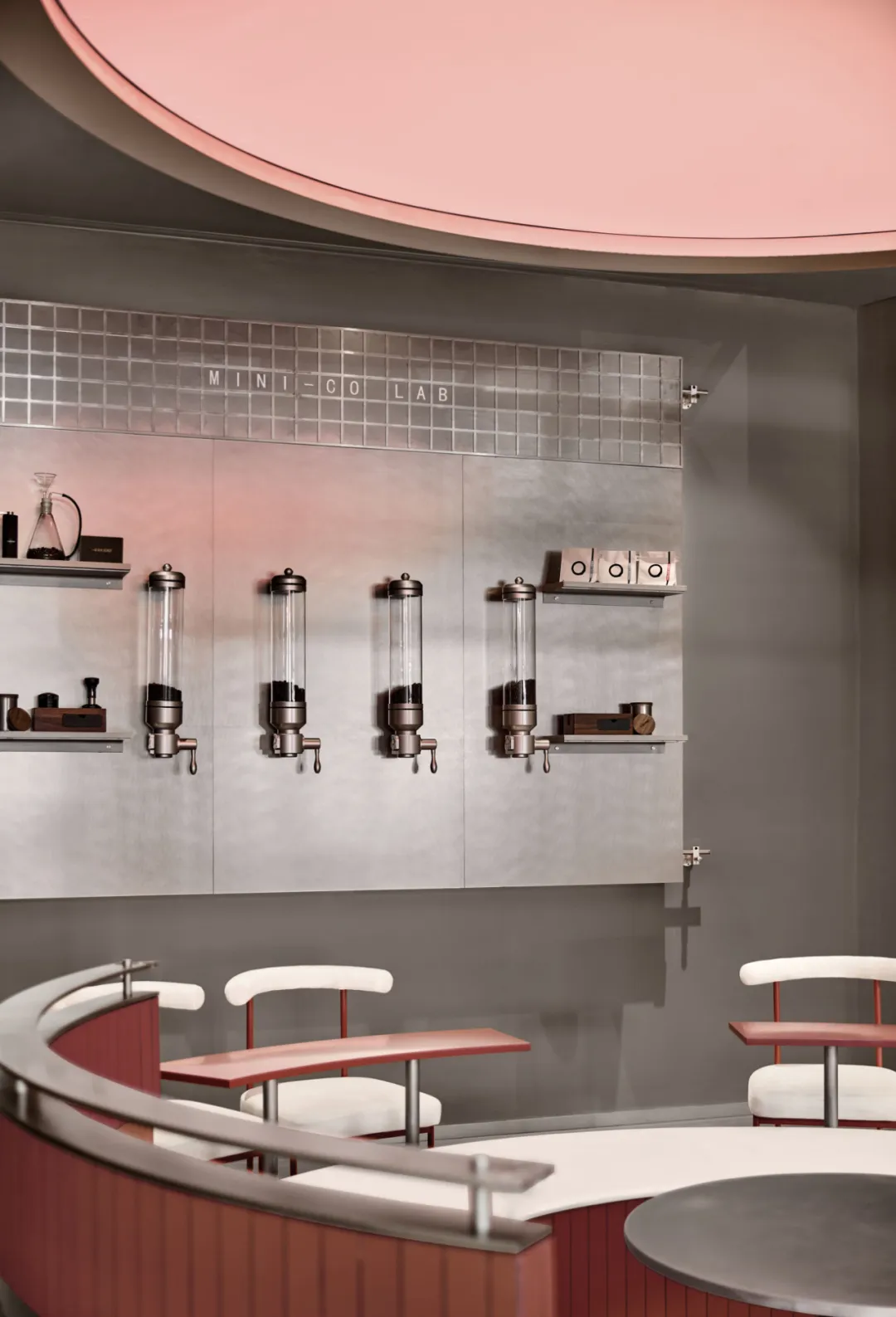
MINI-CO LAB是品牌文化与咖啡物料的双重展演场。墙面物料展示区有序陈列咖啡豆与茶罐,直观呈现产品原料的丰富性;自助调味吧则赋予顾客个性化定制的可能,增添空间互动趣味。开放式布局打破传统展示空间的束缚,让顾客在自由探索中感受咖啡魅力,领略品牌独特内涵。
MINI-CO LAB is a dual exhibition venue for brand culture and coffee materials. The wall material display area displays coffee beans and tea cans in an orderly manner, visually presenting the richness of product raw materials; The self-service seasoning bar provides customers with the possibility of personalized customization, adding interactive fun to the space. Open layout breaks the constraints of traditional display spaces, allowing customers to freely explore and experience the charm of coffee, and appreciate the unique connotation of the brand.
在设计细节的打磨上,笑脸蜘蛛同样倾注全力。这些细节既是对小咖咖啡 “Cup of Surprises” 品质承诺的呼应,更是将其 “简单、健康又有趣” 的品牌理念转化为空间心智语言的核心。在小咖咖啡,每一位顾客在此都能享受品尝咖啡的美好时光,感受从一杯咖啡开始的惊喜与共鸣。
In the polishing of design details, Spider Creative also puts in all its efforts. These details not only echo the quality commitment of MINI-CO's "Cup of Surprises", but also turn its brand philosophy of "simplicity, health, and fun" into the core of spatial mental language. At MINI-CO, every customer can enjoy the wonderful time of tasting coffee and feel the surprise and resonance starting from a cup of coffee.
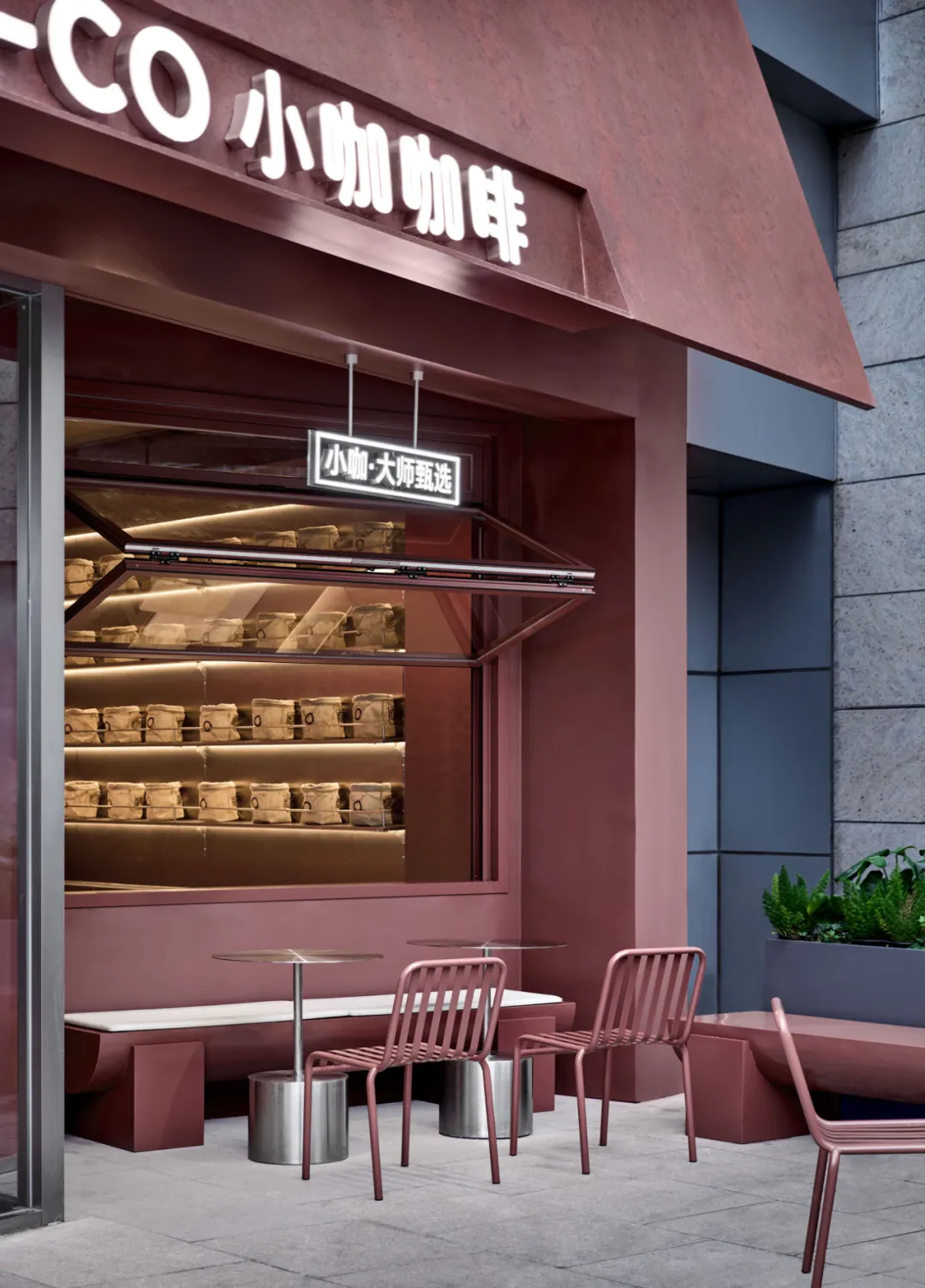
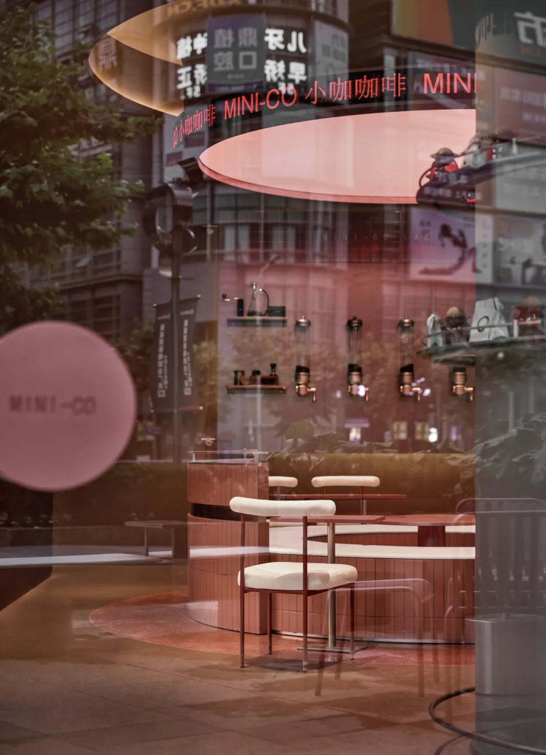
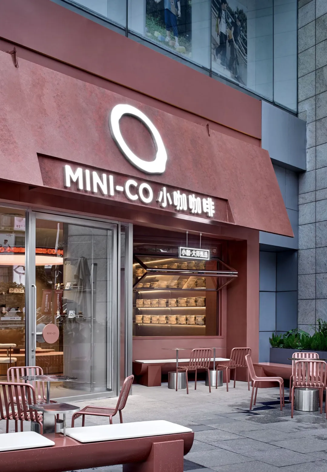
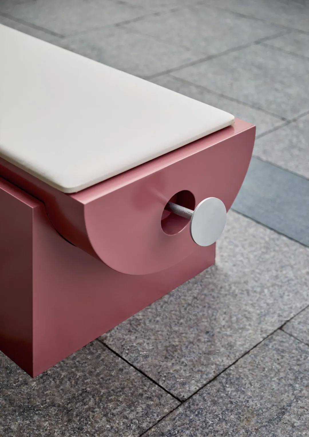
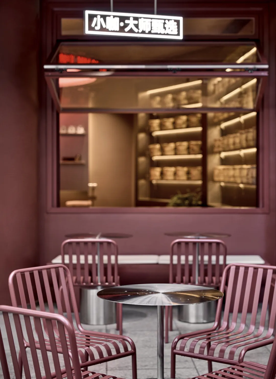
室外空间识别系统以质感红为主基调,配置几何长凳与金属圆桌,辅以白色软垫进行点缀;上方设置 “小咖・大师甄选” 灯牌,有效强化小咖咖啡的品牌辨识度。标志牌下方设计向外开放的折叠窗,从结构维度直观呈现空间的开放属性与包容特质。
The outdoor space recognition system is mainly based on textured red, equipped with geometric benches and metal round tables, supplemented by white soft cushions for decoration; Set up a "MINI-CO·Master Selection" light sign above to effectively enhance the brand recognition of MINI-CO. A folding window that opens outward is designed below the signboard, visually presenting the openness and inclusiveness of the space from a structural dimension.
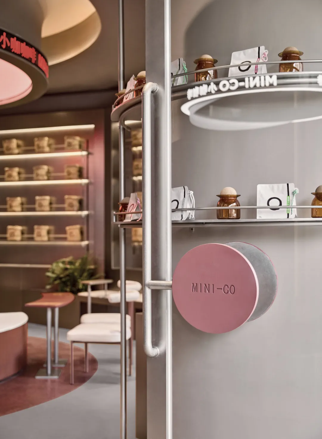
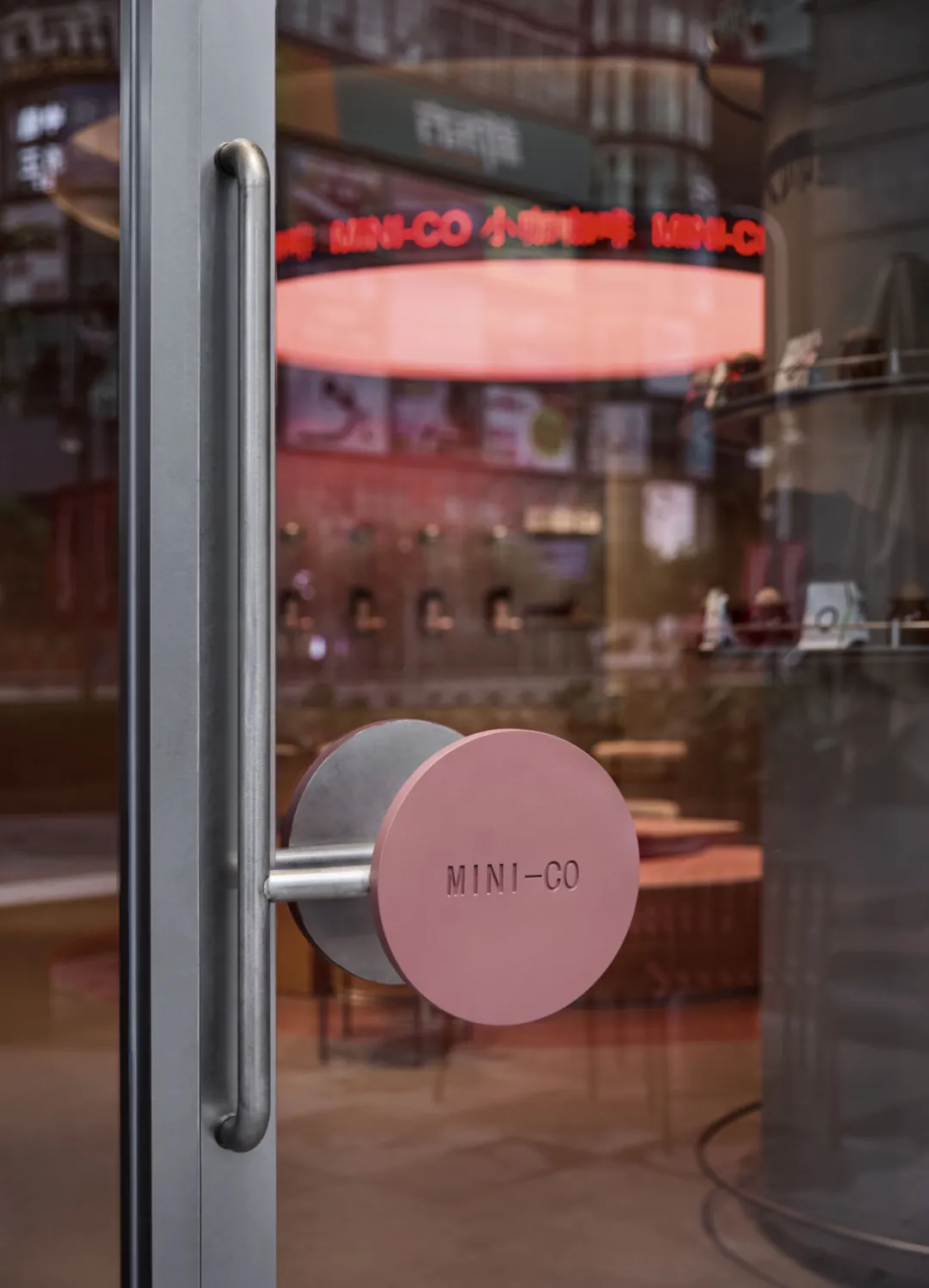
门把手设计灵感源于小咖咖啡品牌的现代简约风格,采用流线型设计,以品牌标识字体为原型,增强顾客熟悉感,触感舒适。金属材质搭配质感红,与品牌标志相呼应,且把手形状符合人体工学,便于握持,开关顺畅,为门店增添亮色与现代感。
The design inspiration for the door handle comes from the modern minimalist style of Xiaoka Coffee brand. It adopts a streamlined design and is based on the brand logo font, enhancing customer familiarity and providing a comfortable touch. The metal material is paired with a textured red color that echoes the brand logo, and the handle shape conforms to ergonomics, making it easy to grip and switch smoothly, adding brightness and modernity to the store.
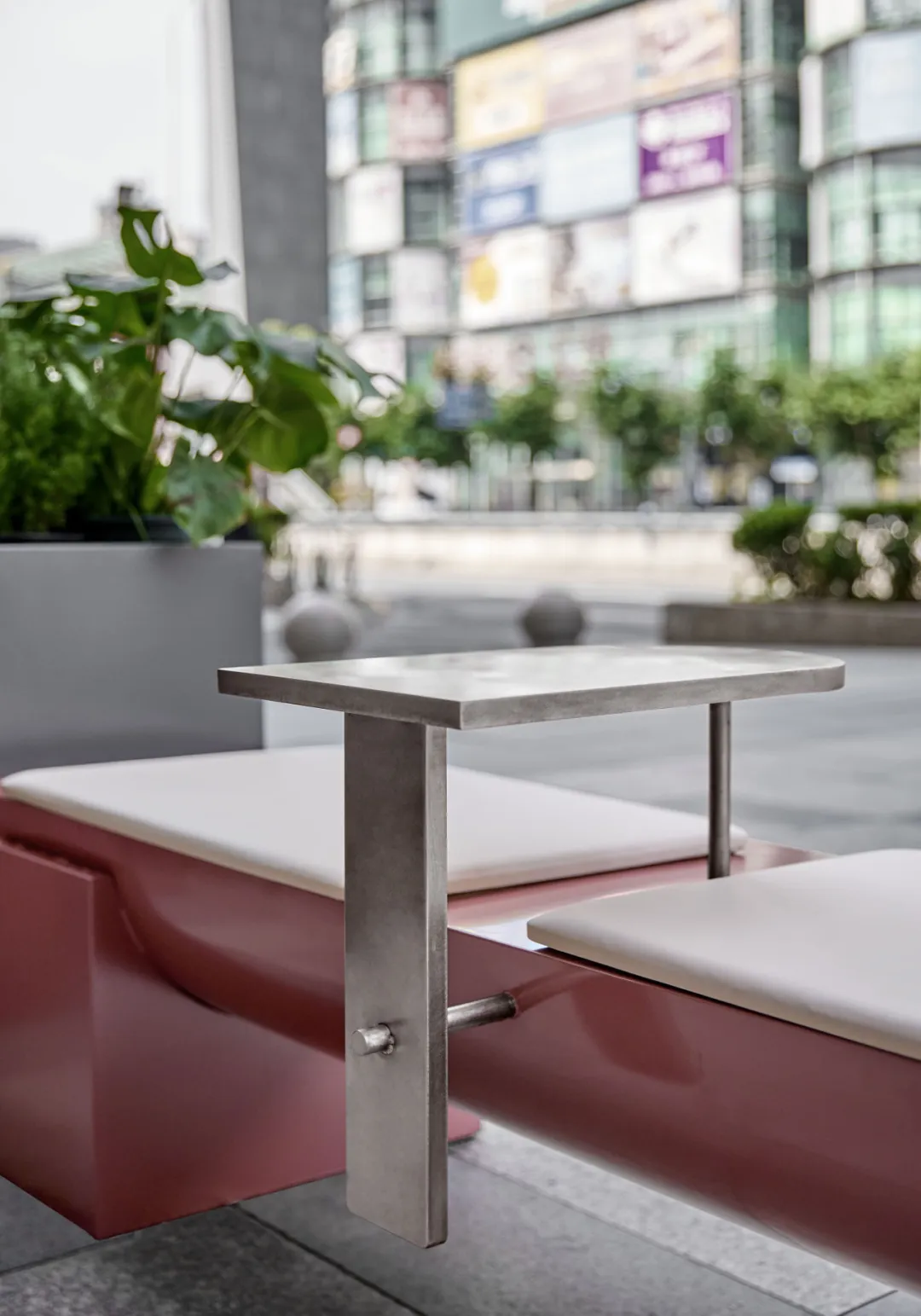
The bench seats in the outdoor area adopt a modular design, integrating customized metal devices for pet placement. This detailed design accurately responds to the needs of pet - owning groups, realizes the safe placement of pets through structured solutions, and ensures the leisure experience of owners. It concretely conveys the brand's friendly attributes and humanistic care in the spatial dimension, forming a deep echo with the warm core of the brand.
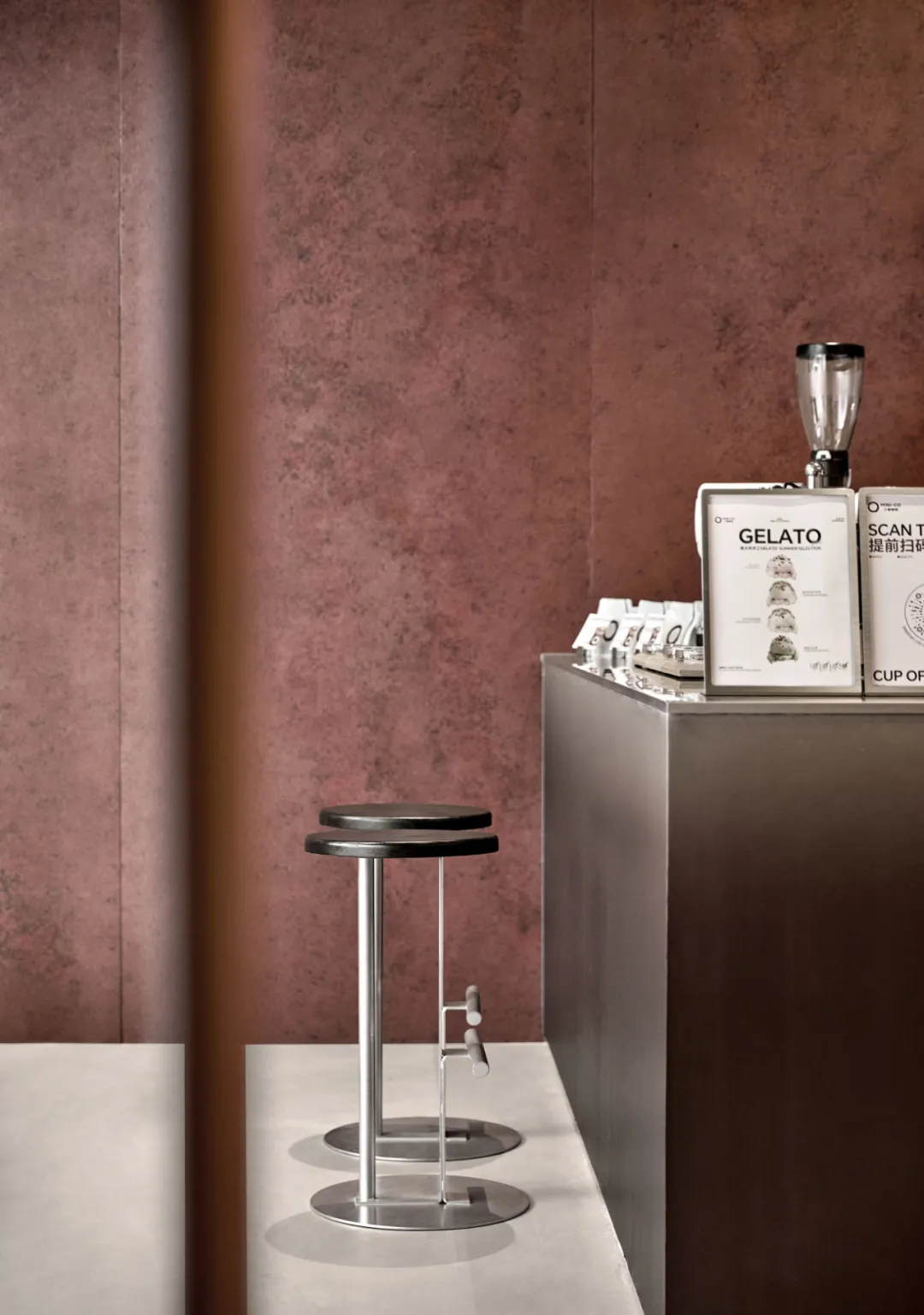
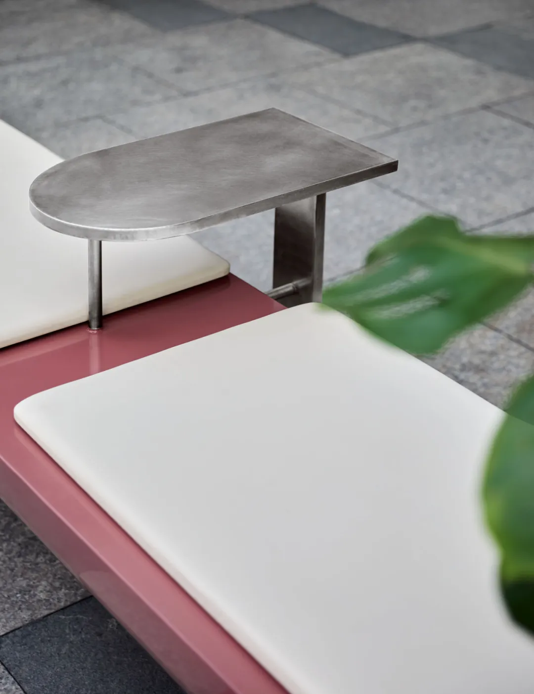
The tables and chairs in the guest area of the indoor space are made of an integrated metal combination of tables and chairs, with white soft cushions that not only neutralize the coldness of the metal and enhance the comfort of sitting, but also echo the overall color tone, combining functionality and aesthetic texture in a simple form.
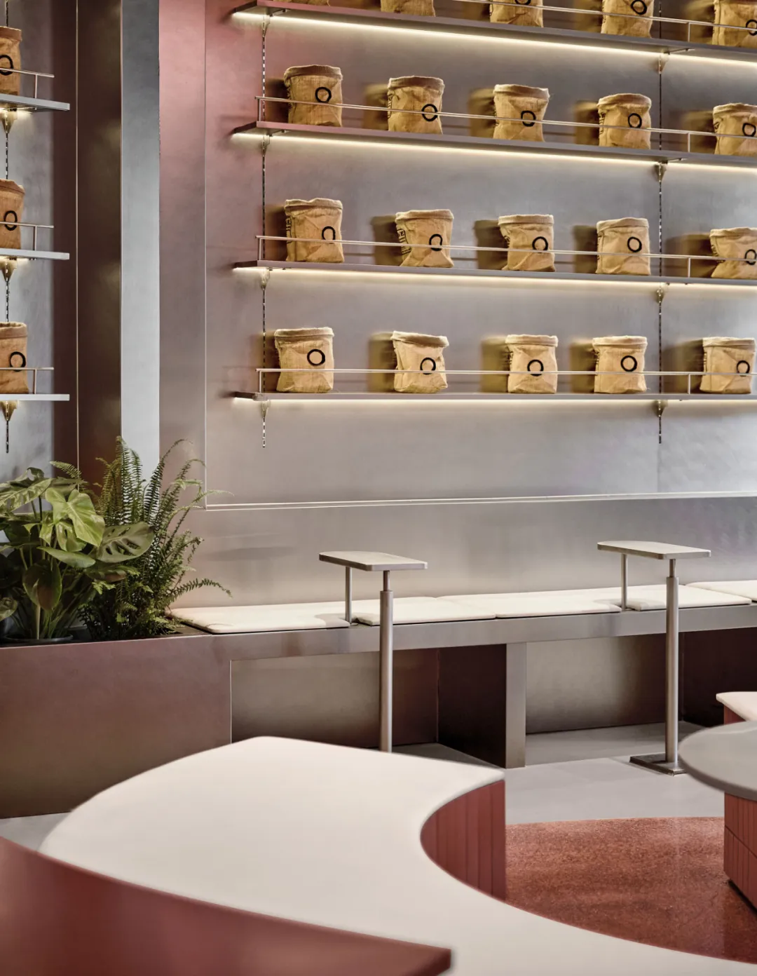
The retail display area takes gray walls as the base, paired with metal display racks of the same color to build a unified visual system, supplemented by soft warm light to form precise lighting levels. The low-saturation gray tone sets a calm display context, and the cold texture of the metal material forms a subtle layer with the wall texture. The directional warm light focuses on the exhibits themselves, which not only strengthens the overall sense of space through the consistency of color systems, but also highlights the key points of brand display through light guidance, in line with the brand's aesthetic proposition of simplicity without losing temperature.
小咖咖啡大师甄选上海首店,我们在概念设计之初围绕了笑脸蜘蛛坚持的四个核心设计思考,既设计中的商业创新,功能模块背后的体验思维,基于品牌基因上的创意和设计的长期主义理念,通过设计为品牌创造长期商业价值。
项目信息
品牌:小咖咖啡
门店:大师甄选上海首店
设计: 笑脸蜘蛛|Spider Creative
摄影:余几
网站:www.spidercreative.cn
Brand: MINI-CO
Store:Shanghai First Reserve Store
Design: Spider Creative
Photography:YUJI
Website: www.spidercreative.cn
Our vision
Spider Creative,based China, leading experience &innovation design around the world.
The founder of Spider Creative has successively held the top design leadership positions in Starbucks, the leading coffee brand, and Heytea, the leading brand of New Tea Drink. He has created and led the internal (in-house) design team, which is responsible for the innovative design of global stores, completed many influential innovative space experience projects, including the exploration of various innovative concepts and the brand flagship potential stores. In the process, he has constantly broken through the design boundary, Not only pursuing excellent design in terms of space and experience, but also being a first-hand experience of the head brand in the new retail industry, he has deeply know that design plays a vital role in an enterprise. Spider Creative,founded in China, leading experience &innovation design around the world and through design to create value for gloabl brands.